Redesign of Check24

Redesign of Check24

course

Application Design

team

anastasia Lorenz

Sina Barth

semester

Winter semester 2022/23

our goal

our goal

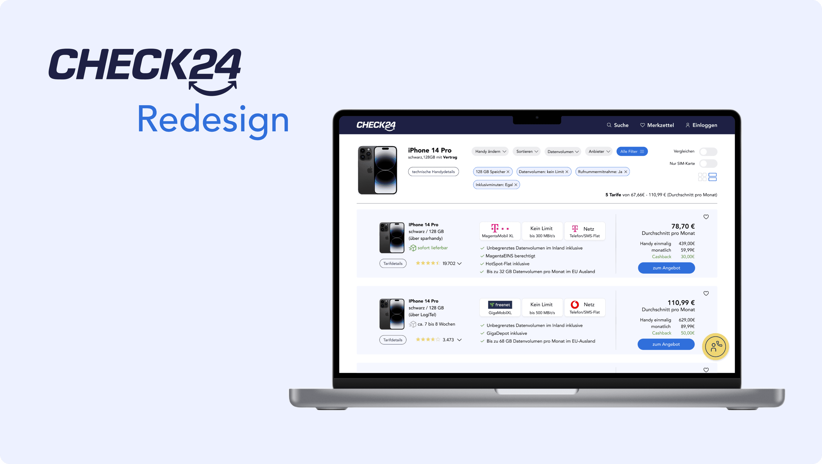
Check24 is a price comparison portal for various product categories. We decided to create a redesign for Check24 as we saw significant potential for the website to become more organized and better structured. We focused specifically on comparing mobile contracts in order to concentrate on a specific user flow and delve into the details.

Check24 is a price comparison portal for various product categories. We decided to create a redesign for Check24 as we saw significant potential for the website to become more organized and better structured. We focused specifically on comparing mobile contracts in order to concentrate on a specific user flow and delve into the details.

Key Findings

After conducting a comprehensive analysis of the existing Check24 website, we have gained valuable insights that have inspired us to identify four key findings. These formed the foundation for our redesign.

Info & Filters

Key information and filters always in view.
Linear comparison process

Linear comparison process should be retained and optimized.
Hierarchy

More hierarchy is needed.

Help & Contact

Help and contact must always be accessible.

Personas / HMW’s

Ben

40 years old, married, computer scientist


“How can we provide Ben with a personalized, clear, and objective presentation of all offers?”

Agnes

21 years old, single,
student


“How can we provide Agnes with clear information about bargains?”

Alexander

40 years old, married, electrician

“How can we provide Alexander with accurate and clear information?”
Onboarding

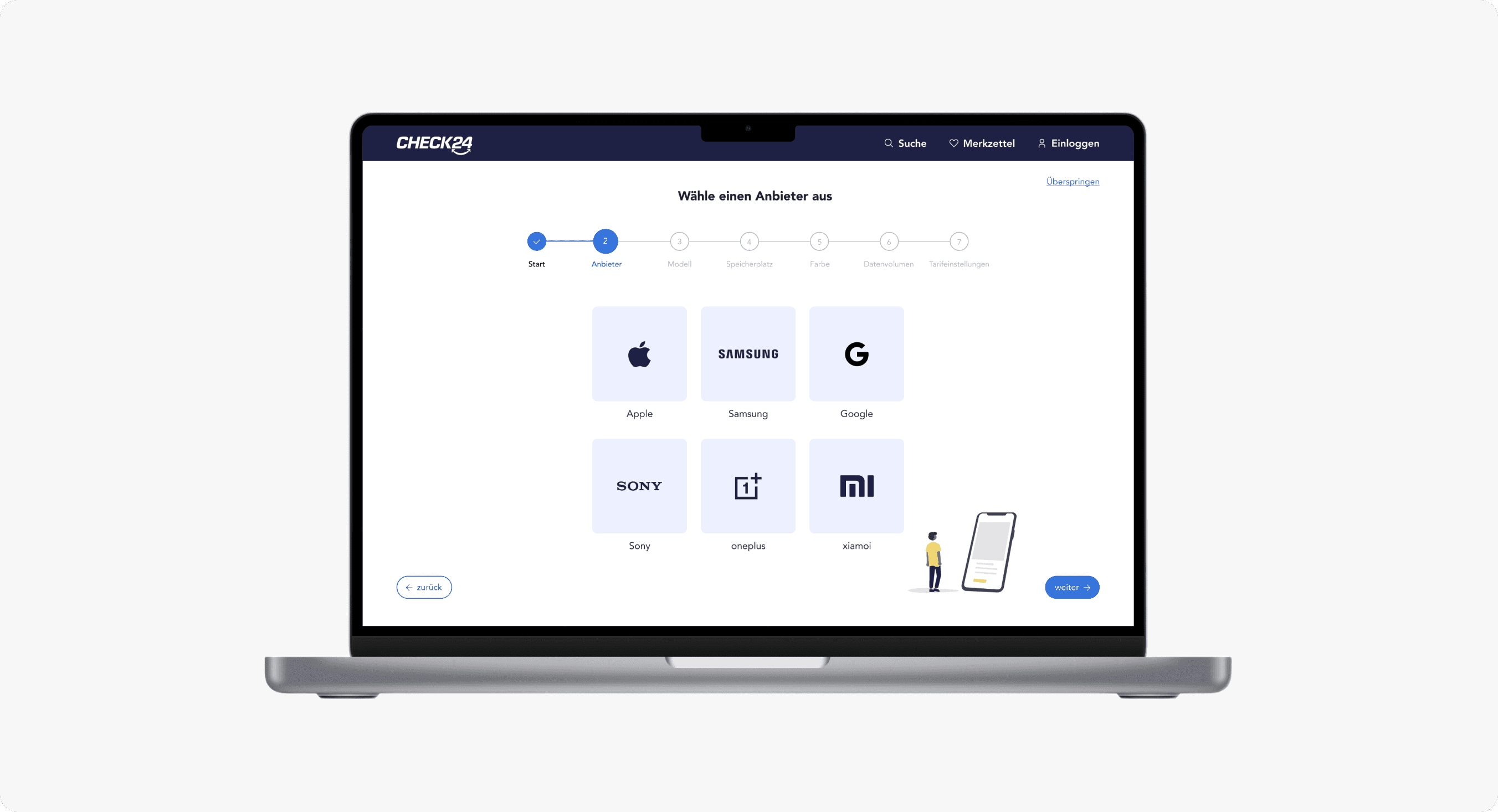
We have decided to integrate an onboarding process to reduce the overwhelming amount of information and filters on the detail page.
This will provide users with a clear and straightforward starting point for
their mobile tariff comparison. Users will be able to assemble their desired phone step by step.

Color concept

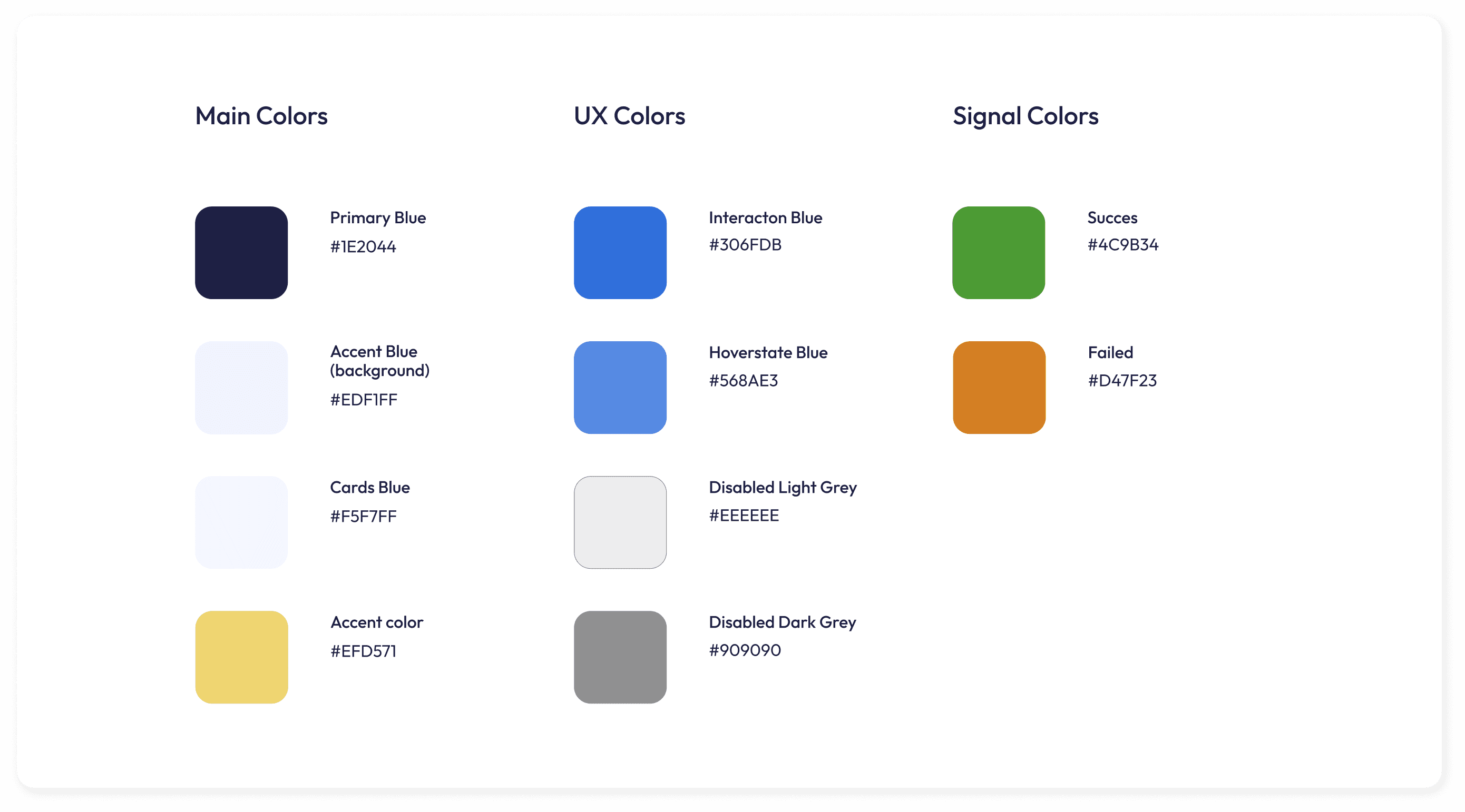
As this is a redesign of an already established company, it was important for us to stay close to the existing colors but modernize them. Ultimately, we chose a deep, crisp blue as the primary color, combined with a soft light blue. For the accent color, we opted for a gentle yellow to complement the overall impression harmoniously.

Illustrations

To remove some of the strictness from the visual appearance, we implemented a geometric design language with rounded corners, along
with selectively integrating illustrations into the screens. For this, we
utilized illustrations from the website undraw.co and customized them to fit our needs.

Font

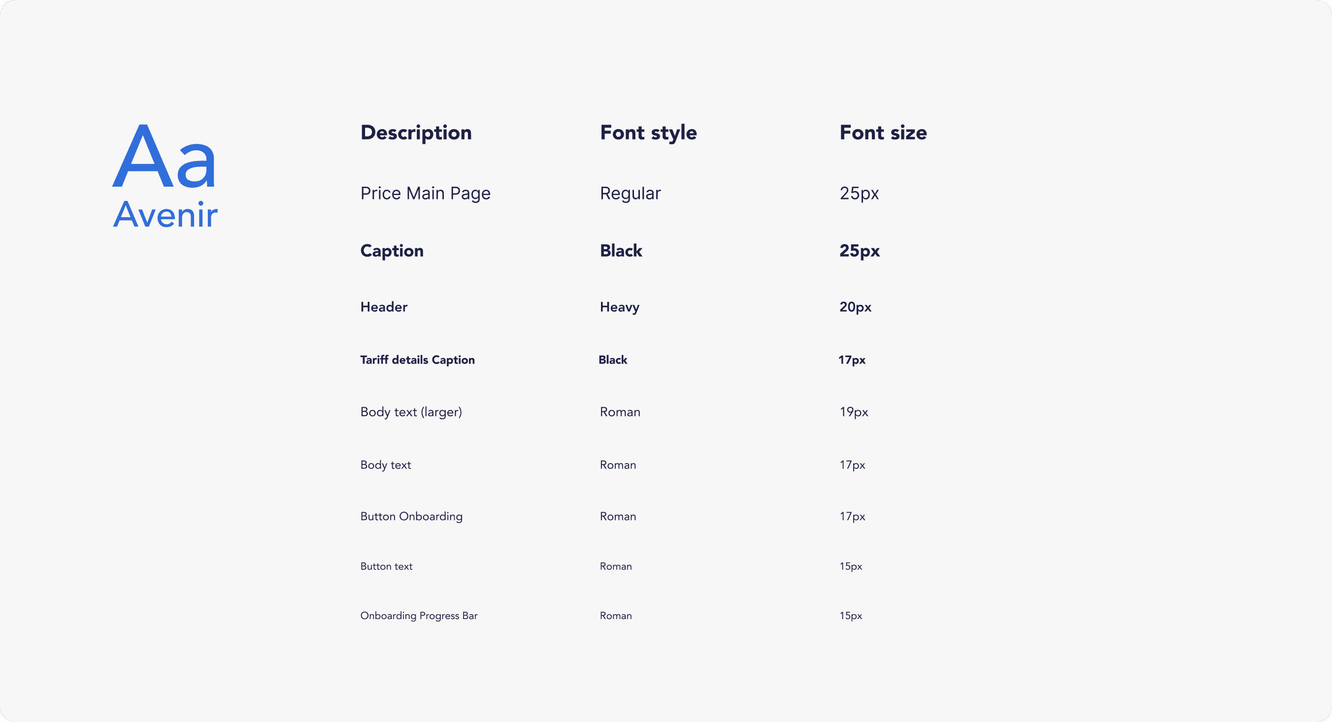
Due to its geometric clarity, Avenir was particularly well-suited for presenting a large amount of information clearly and legibly while still creating a modern overall effect. Additionally, Avenir has a very friendly appearance, which accurately reflects the character of our redesign.

Product video

Impressum

Angaben gemäß § 5 TMG

Louise Tritschler

Königsturmstraße 39

73525 Schwäbisch Gmünd


© Louise Tritschler 2023

Impressum

Angaben gemäß § 5 TMG

Louise Tritschler

Königsturmstraße 39

73525 Schwäbisch Gmünd


© Louise Tritschler 2023

Impressum

Angaben gemäß § 5 TMG

Louise Tritschler

Königsturmstraße 39

73525 Schwäbisch Gmünd


© Louise Tritschler 2023